
Pratt fine arts center: visual design update
Conducting a usability study to improve the experience of booking a REI Adventure.
THE PROJECT
Art is not only a form of creative expression, but a transformative way to bring a community together. The Pratt Fine Arts Center works to make art accessible and inclusive to all through a wide range of fine art programs, education, and classes that support the pursuit of creativity for those of all ages and skill levels. For this project, I created a new visual design system and brand that would honor Pratt’s mission.
This unsponsored work was completed as part of the Human-Centered Design & Engineering MS program at the University of Washington.
MY ROLE
Designer
DURATION
3 Months
THE TOOLS
Figma
Photoshop
create outside of the box
Creative exploration
Be expressive, try something new, or play with creativity.
Community-focused
Meet others, create something together, develop empathy.
Art is for everyone
Create art no matter your age, skill level, or background.
The fine arts have an inherently playful and exploratory nature that I wanted to convey in the new visual design system. I wanted someone interacting with the visual design to feel inspired and to imagine what kind of art they might create. Based on these three communication goals of the system, I started with a moodboard that I felt embodied creativity that’s unrestrained and joyous. I included textures that echo the tactile materials used in fine arts and a mix of overlapping organic and geometric shapes.
the logo
The new logo represents creativity unleashed, with organic shapes textured with fine art materials weaving in and out of the bounds of the box and letters.
GUIDELINES
selecting a logo
Use the full logo when space allows, when context has not yet been established, or when “Pratt Fine Arts Center” is not prominently displayed on the content.
Use the abbreviated logo when there is minimal space and context has already been established, or when “Pratt Fine Arts Center” is prominently displayed on the content.
When in doubt, use the full logo.
Select the appropriate logo to contrast with a light or dark background, such as in the examples above.
logo placement
Always remain proportional, never skewed or scaled without being constrained to fit in a space.
Place logo near the upper right or bottom right corner while adhering to margins.
Ensure that the content around logo is spaced correctly so the logo is not crowded or sized too small to be legible.

COLOR PALETTE
The palette uses neutrals to represent materials used in fine arts, such as clay and canvas. The use of complementary rose and teal colors provide contrast for elements in the visual design.
BACKGROUNDS
There are three background colors in this visual system that coordinate with one another.
ACCENTS & TEXT
Accent colors are a way to help visually provide meaning to text on a website.
For body text, it’s important to ensure the most amount of contrast against a background color.


type & hierarchy
This visual design system uses two typefaces, Luxora Grotesk and Merriweather. Luxora Grotesk is a san serif font with a tall x-height that makes it perfect for headings and links. To complement this, the transitional serif Merriweather typeface provides a classic yet contemporary font for body content.

IMAGERY
Because Pratt is an art organization, images serve a crucial purpose in conveying the content and context of the mission. From inspiring creativity and community to representing an artist’s work, the goal of images in the visual system are not only aesthetic but functional.
STATIC IMAGES
These are decorative images that serve to emphasize the community aspect of Pratt’s mission with a focus on people.
Always use images of people. With the exception of profile images, the subjects should be engaging in an activity that matches the context.
Used most often in tertiary backgrounds, headers, or instructor profiles.
Are not to be used as part of any interactive element, such a tiles or cards.
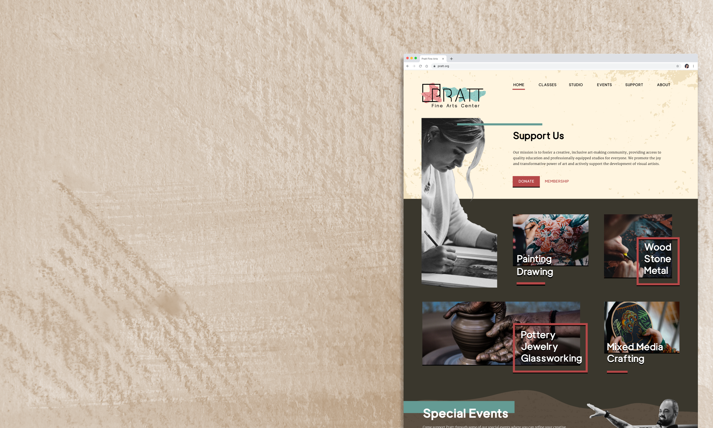
LINKED IMAGES
These are images that are used with interactive elements, such as category tiles, class tiles, or event cards.
For category tiles: The image should be focused on a contextually appropriate activity, such as hands sculpting. The main subject should not be a person, but the process of making art.
For class tiles: The image should use artwork that represents the what could or has been made in the class. The artwork should be clearly represented as the central focus.
For event cards: Images should include people but represent the event. For example, an image of the artist giving the art talk or an image of children making art for a Pratt event for kids.

grid system
The visual design system uses a 14 column grid layout with margins for the website. On a desktop view of the website that’s 1440px wide, margins are 90px with gutters of 10px.
Tiles adhere to a 3 column layout within the 14 column grid system. Although they may not look like it at first glance, all tiles within the grid are of consistent sizing. Short tiles are 4 columns + 1 gutter and long tiles are 9 columns + 1 gutter.
GENERAL GUIDELINES
All content should adhere to the margins with the exception of header accents, static images, and tertiary background shapes.
Elements on tertiary backgrounds can use different spacing and aren’t required to adhere to the 3 column layout of tiles.
No single image or body copy should span the entire width of the grid. This does not apply to background patterns or shapes.
TILE GUIDELINES
There are two variants of tiles (underline and square) and of those, they can be either short or long in width.
Always alternate tile variants in a row.
Include at least one long tile every other row in a section.
Tiles adhere to the 3 column layout within the 14 column system and always respect margins.

APPLIED VISUAL SYSTEM


reflection
I’ve always felt that I was able to intuit aspects of good visual design despite never having gone to any art or design school. Going into this class, I felt it would be a breeze but really I was humbled at how much I didn’t know. I learned so much and now have the framework and the words to describe the things that I didn’t really know how to describe before. Building on top and working layer by layer to create a fully baked visual design system was an incredible learning experience. My biggest takeaway or rather, a validation, is how much creativity comes from constraints. By building my visual design system step by step and giving myself constraints based on usability best practices, I found that I was thinking of creative hacks and solutions that I wouldn’t have considered had I gone full blue sky.