
cbd product branding for chanvre
Designing a line of high-end CBD grooming products from the ground up.
THE PROJECT
I was approached to design a logo and product label for a new CBD company called Chanvre. The company produces premium CBD grooming products and initially was geared toward men. After my original pitch and brand teaser, I was brought on for additional work around branding, graphic design, package design, and copy.
MY ROLE
Product and brand designer
Copywriter
DURATION
10 Months
THE tools
Adobe Illustrator
Adobe Photoshop
brand teaser
The Chanvre founders wanted to move fast. Real fast. I was given only three days to create a pared down brand teaser. I started by roughly defining what the brand was and what the client’s target customer would be like. Because of the time constraints, I performed some quick and dirty market research by speaking to male friends about what they look for in a luxury grooming product and how they felt about CBD products.

BEHIND THE LOGO
Based on the client goals and examples of other product brands they liked, I chose to use typeface as design with a simple wordmark logo. I chose a modern san serif typeface with slightly squared off curves hinting at a subtle masculine look. I wanted there to be a separate statement piece that could be paired with the wordmark when context was already established. For this, I created an icon logo by breaking apart the word “chanvre” to find it’s Latin letter. The shape of the letter felt optimistic, reaching up and out, and was a perfect representation of how we would want a customer to feel using a Chanvre product.
THE LABEL CONCEPT
Because Chanvre products are infused with CBD and not THC (which is federally illegal,) I decided to avoid any use of hemp leaves in the label design. During my interviews with men, a few had expressed concern about “looking like a pothead” in reference to products that overuse hemp designs and branding. Using a few different typefaces, I created a text-forward product label that I felt was both elegant and masculine. I also started thinking about the use of the icon logo in a corner shape that would make the label distinct at a glance.


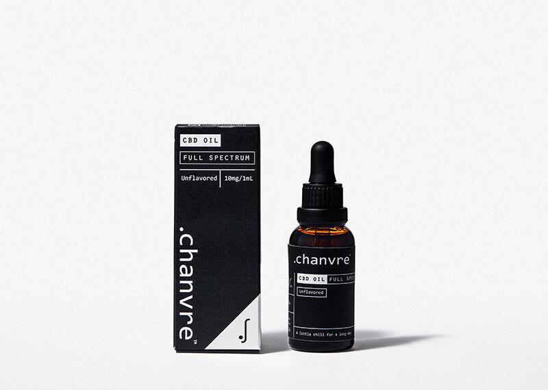
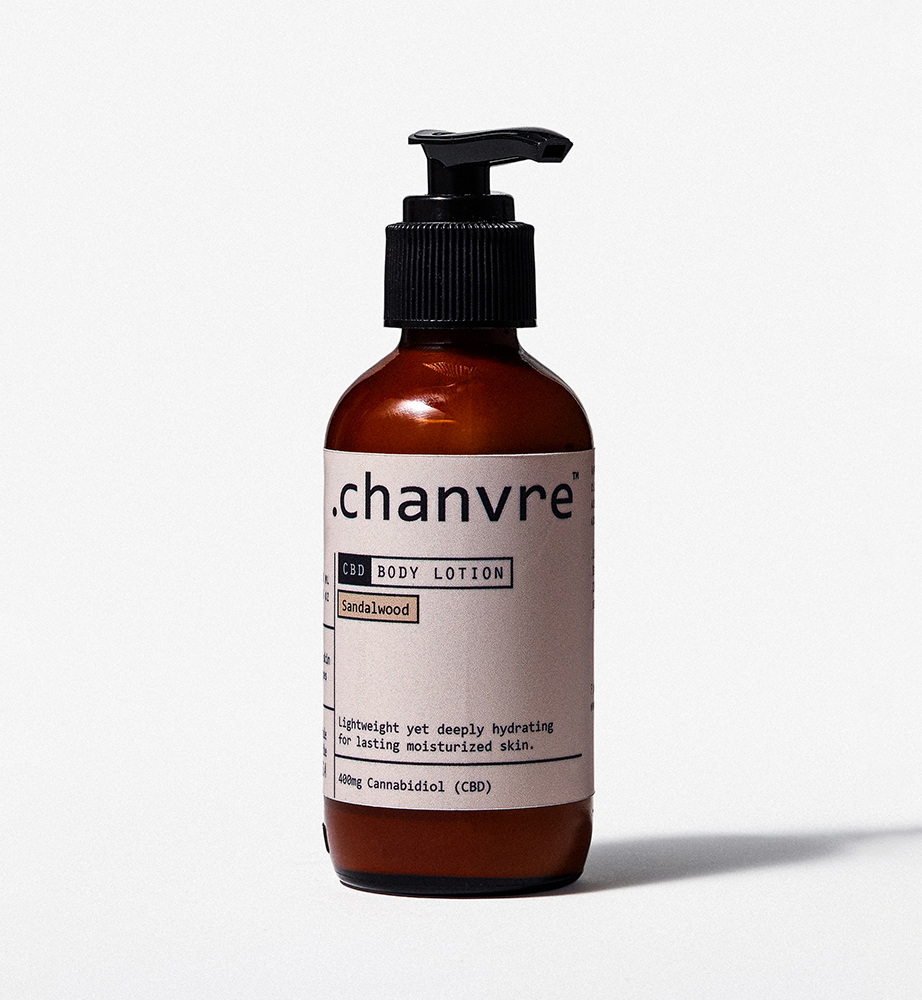
a simpler label
The final iteration of the label was simplified by reducing the flavor text to a single line and moving lesser important info to the rear of the label. I reduced the number of typefaces and by the request of the client, we introduced a neutral label variant to pair with the black label. As I learned more about the flavor and scent variants for each product, I began to use color as a way to help customers easily distinguish these.
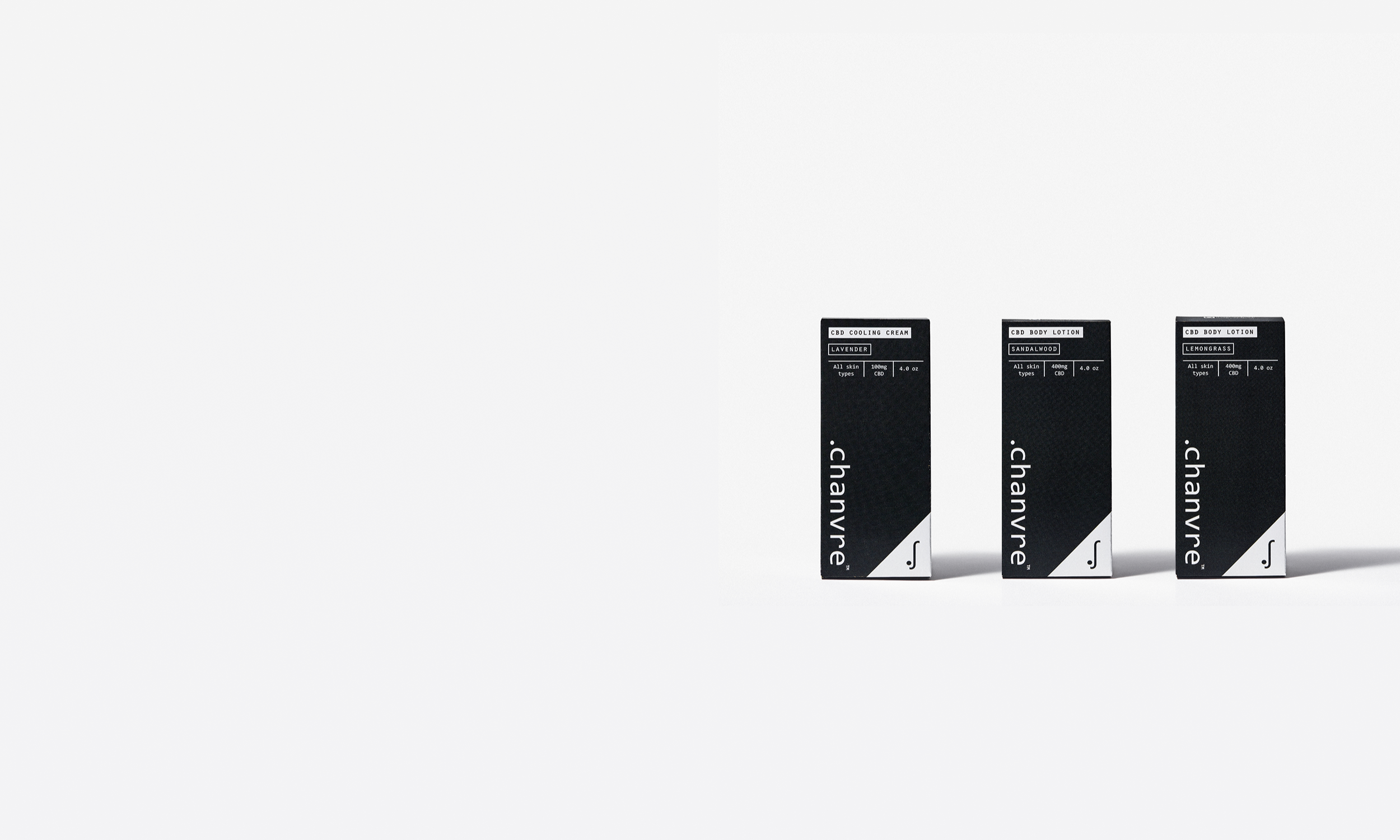
thoughtful package design
I was asked to also design the packaging, which meant that I could ensure that customers were presented with a cohesive buying experience that was an extension of the brand. Whether the box carton is on a shelf at a store or someone is opening the mailer box for the first time, I wanted the look to emulate how the product should feel in your hands—elegant and mature.
LOOKS GOOD. NO MATTER THE ANGLE.
The corner icon motif became a hallmark of the brand’s packaging design. While designing the dielines for the box cartons and mailers, this accent ensured that the product looked distinct no matter what angle it was being viewed from. I also created custom iconography for active ingredients to highlight each product’s unique health benefits.

REFLECTION
I had a lot of fun developing an initial brand design and creating dielines. Packaging isn’t something I work on often, and the ability to flex some rusty skills made this project a fun one to work on. In retrospect, I wish the founders and I did some more preliminary market and brand research together first. At the beginning, I didn’t realize that the company founders didn’t have a clear vision of where they wanted to company to go and what market needs they would fill. I think if time and resources weren’t such a constraint, I would have liked to do a deep dive before offering brand directions. It felt as through throughout the process, things that were agreed “pillars” would suddenly change, and I’d constantly be adjusting designs and copy to make it work. While I don’t mind scrappy work, the lack of direction from the founders created more cycles than needed. In the future, I’d want to make sure work that I do is based on a relatively fleshed out vision, or at least communicate better with stakeholders about what the best process for iterating is.
